
Brand Strategy
Brand Strategy
Brand Strategy
1. Space Experience Open, airy layout with natural wood, raw concrete, and plenty of natural light.
Plants, ceramic wall installations, and scent elements (e.g., clay, lavender) to elevate the sensory experience.
Offer tea/coffee corner for post-session calm and community conversation.
1. Space Experience Open, airy layout with natural wood, raw concrete, and plenty of natural light.
Plants, ceramic wall installations, and scent elements (e.g., clay, lavender) to elevate the sensory experience.
Offer tea/coffee corner for post-session calm and community conversation.
1. Space Experience Open, airy layout with natural wood, raw concrete, and plenty of natural light.
Plants, ceramic wall installations, and scent elements (e.g., clay, lavender) to elevate the sensory experience.
Offer tea/coffee corner for post-session calm and community conversation.
2. Target Audience Creatives, mindful makers, weekend hobbyists, and design-conscious consumers. Urban dwellers seeking a tactile, analog escape from digital overload.
2. Target Audience Creatives, mindful makers, weekend hobbyists, and design-conscious consumers. Urban dwellers seeking a tactile, analog escape from digital overload.
2. Target Audience Creatives, mindful makers, weekend hobbyists, and design-conscious consumers. Urban dwellers seeking a tactile, analog escape from digital overload.
3. Offerings Pottery classes (beginner to advanced) Community firings and open studio hours Seasonal workshops (e.g., Tea Bowl Making, Earthy Glazes) Curated retail shelf of studio-made ceramics
3. Offerings Pottery classes (beginner to advanced) Community firings and open studio hours Seasonal workshops (e.g., Tea Bowl Making, Earthy Glazes) Curated retail shelf of studio-made ceramics
3. Offerings Pottery classes (beginner to advanced) Community firings and open studio hours Seasonal workshops (e.g., Tea Bowl Making, Earthy Glazes) Curated retail shelf of studio-made ceramics
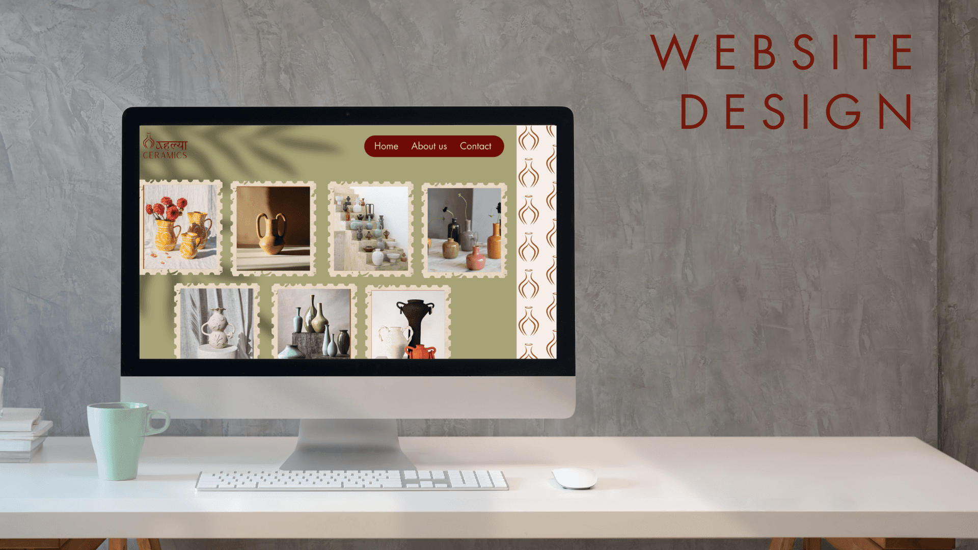
4. Content Strategy Instagram + Pinterest: share process videos, glaze-pouring reels, cozy studio moments. Blog/Newsletter: "Notes from the Wheel" - featuring artist interviews, behind-the-scenes, and seasonal design inspiration. Events: Studio open houses, collabs with florists/chefs for ceramic pop-ups.
4. Content Strategy Instagram + Pinterest: share process videos, glaze-pouring reels, cozy studio moments. Blog/Newsletter: "Notes from the Wheel" - featuring artist interviews, behind-the-scenes, and seasonal design inspiration. Events: Studio open houses, collabs with florists/chefs for ceramic pop-ups.
4. Content Strategy Instagram + Pinterest: share process videos, glaze-pouring reels, cozy studio moments. Blog/Newsletter: "Notes from the Wheel" - featuring artist interviews, behind-the-scenes, and seasonal design inspiration. Events: Studio open houses, collabs with florists/chefs for ceramic pop-ups.
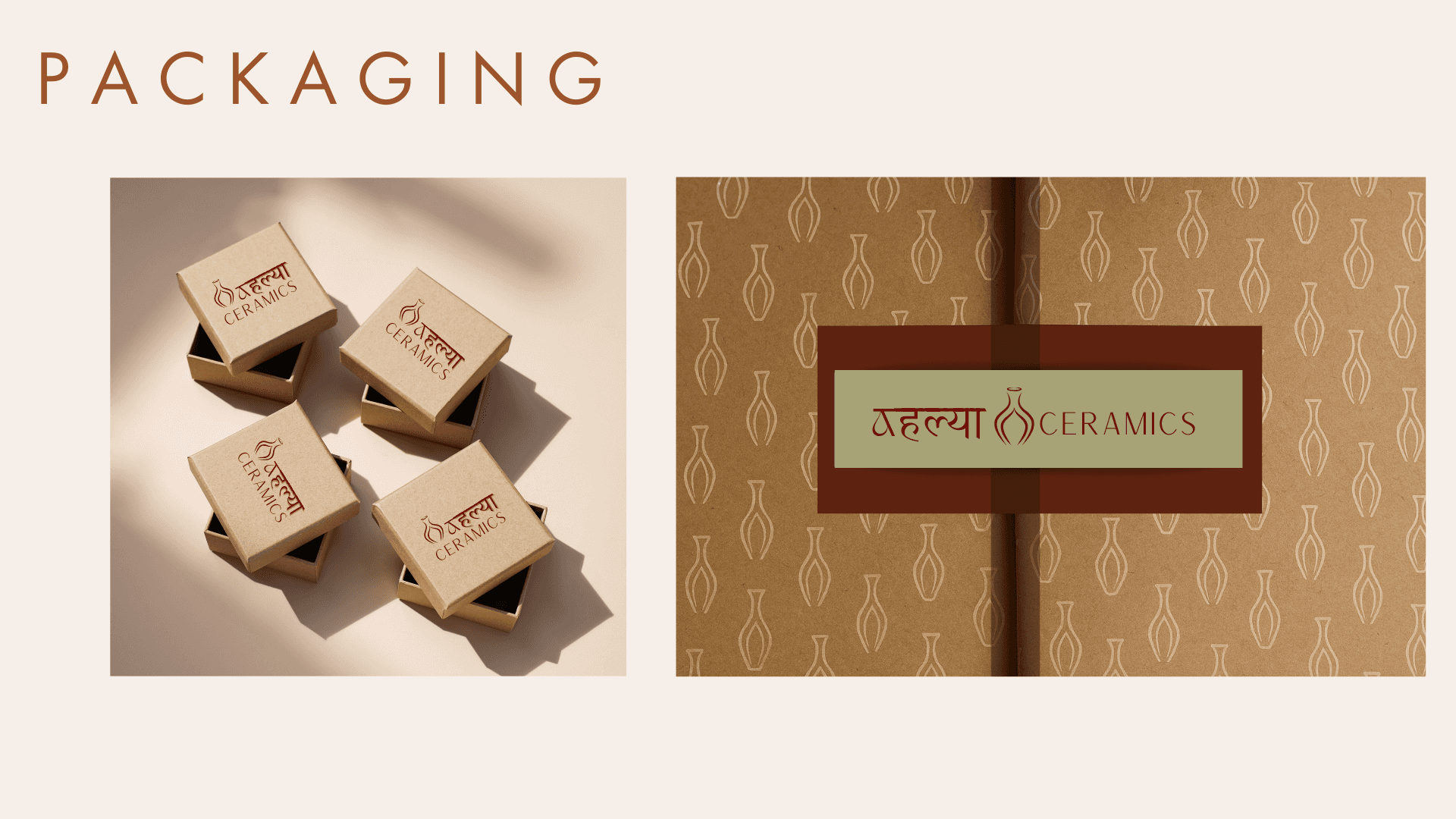
5. Sustainability Angle Use locally sourced clay when possible Offer recycled clay bins Eco-packaging for ceramic sales Highlight stories of materials and process
5. Sustainability Angle Use locally sourced clay when possible Offer recycled clay bins Eco-packaging for ceramic sales Highlight stories of materials and process
5. Sustainability Angle Use locally sourced clay when possible Offer recycled clay bins Eco-packaging for ceramic sales Highlight stories of materials and process
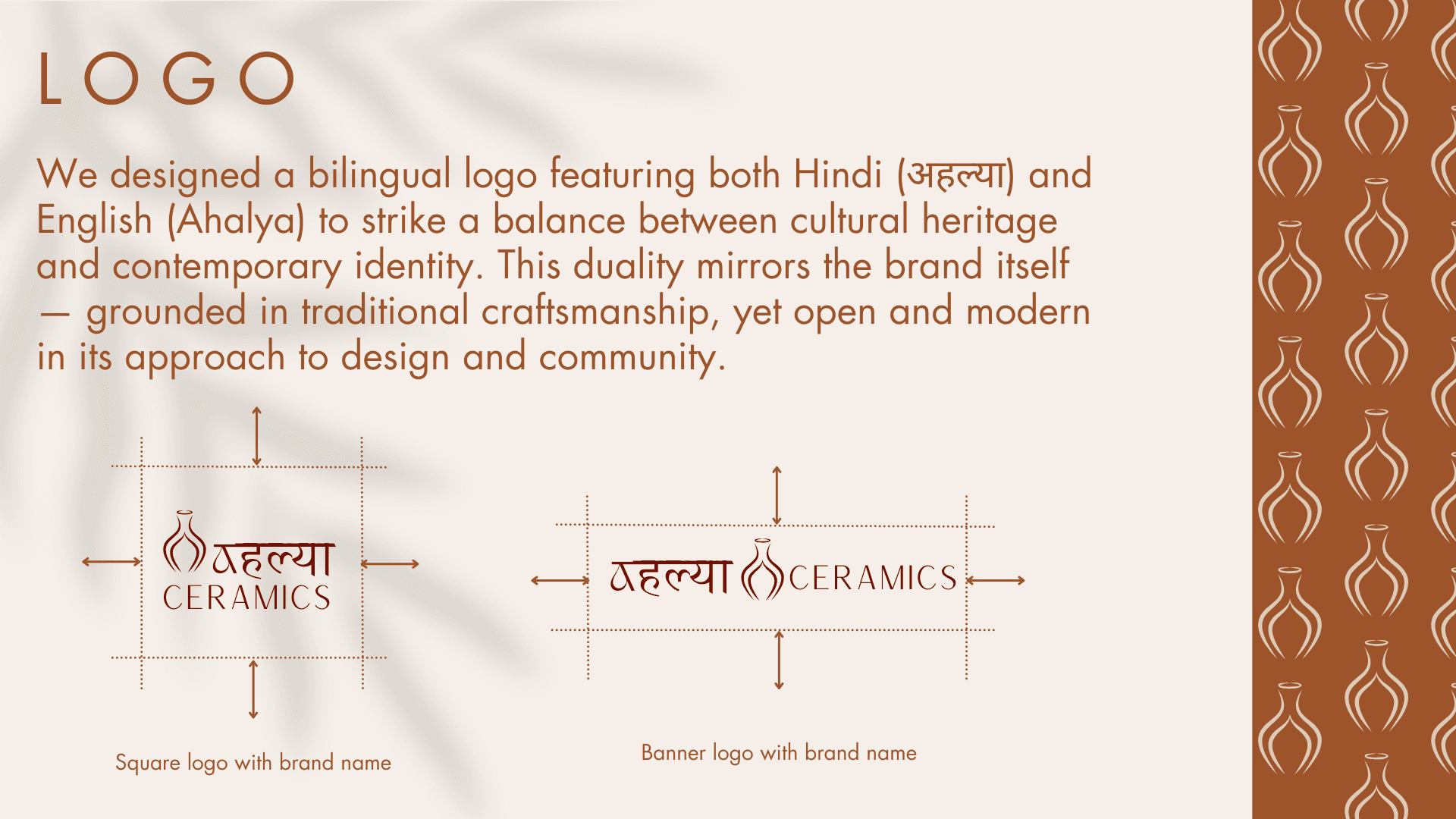
Bilingual Logo Design: Hindi + English
Bilingual Logo Design: Hindi + English
Bilingual Logo Design: Hindi + English
Why Hindi + English?
Why Hindi + English?
Why Hindi + English?
Objective: To create a brand identity that reflects the rooted, artisanal soul of the studio while remaining accessible and resonant with a broader audience.
Objective: To create a brand identity that reflects the rooted, artisanal soul of the studio while remaining accessible and resonant with a broader audience.
Objective: To create a brand identity that reflects the rooted, artisanal soul of the studio while remaining accessible and resonant with a broader audience.
Concept: We designed a bilingual logo featuring both Hindi (अहल्या) and English (Ahalya) to strike a balance between cultural heritage and contemporary identity. This duality mirrors the brand itself - grounded in traditional craftsmanship, yet open and modern in its approach to design and community.
Concept: We designed a bilingual logo featuring both Hindi (अहल्या) and English (Ahalya) to strike a balance between cultural heritage and contemporary identity. This duality mirrors the brand itself - grounded in traditional craftsmanship, yet open and modern in its approach to design and community.
Concept: We designed a bilingual logo featuring both Hindi (अहल्या) and English (Ahalya) to strike a balance between cultural heritage and contemporary identity. This duality mirrors the brand itself - grounded in traditional craftsmanship, yet open and modern in its approach to design and community.
Cultural Resonance: The name Ahalya holds significance in Indian heritage. Rendering it in Devanagari script evokes a sense of authenticity and reverence.
Cultural Resonance: The name Ahalya holds significance in Indian heritage. Rendering it in Devanagari script evokes a sense of authenticity and reverence.
Cultural Resonance: The name Ahalya holds significance in Indian heritage. Rendering it in Devanagari script evokes a sense of authenticity and reverence.
Approachability: The English version ensures the brand remains legible and recognizable to an international and non-Hindi-speaking audience.
Approachability: The English version ensures the brand remains legible and recognizable to an international and non-Hindi-speaking audience.
Approachability: The English version ensures the brand remains legible and recognizable to an international and non-Hindi-speaking audience.
Visual Harmony: The typographic contrast between the curves of Devanagari and the clean, minimal English font creates a visually engaging and meaningful logo.
Visual Harmony: The typographic contrast between the curves of Devanagari and the clean, minimal English font creates a visually engaging and meaningful logo.
Visual Harmony: The typographic contrast between the curves of Devanagari and the clean, minimal English font creates a visually engaging and meaningful logo.
Design notes:
Design notes:
Design notes:
The two scripts are treated with equal respect and space. We selected a hand-drawn style for the Devanagari script to echo the handcrafted nature of ceram ics. The English font is a soft serif with organic flow, complementing the warmth of the overall brand.
The two scripts are treated with equal respect and space. We selected a hand-drawn style for the Devanagari script to echo the handcrafted nature of ceram ics. The English font is a soft serif with organic flow, complementing the warmth of the overall brand.
The two scripts are treated with equal respect and space. We selected a hand-drawn style for the Devanagari script to echo the handcrafted nature of ceram ics. The English font is a soft serif with organic flow, complementing the warmth of the overall brand.
Outcome: The bilingual logo serves as a visual bridge between tradition and modernity, between local and global - much like Ahalya Ceramics itself.
Outcome: The bilingual logo serves as a visual bridge between tradition and modernity, between local and global - much like Ahalya Ceramics itself.
Outcome: The bilingual logo serves as a visual bridge between tradition and modernity, between local and global - much like Ahalya Ceramics itself.
Concept: The logo icon is a minimalist vase shape drawn with double lines, symbolizing both the form of a finished ceramic piece and the process of its creation. On closer look, the curves of the vase subtly resemble two hands in motion, evoking the imagery of a potter at the wheel.
Concept: The logo icon is a minimalist vase shape drawn with double lines, symbolizing both the form of a finished ceramic piece and the process of its creation. On closer look, the curves of the vase subtly resemble two hands in motion, evoking the imagery of a potter at the wheel.
Concept: The logo icon is a minimalist vase shape drawn with double lines, symbolizing both the form of a finished ceramic piece and the process of its creation. On closer look, the curves of the vase subtly resemble two hands in motion, evoking the imagery of a potter at the wheel.
Symbolism: The Vase: Represents the final product - functional beauty born from raw material and intention.
Symbolism: The Vase: Represents the final product - functional beauty born from raw material and intention.
Symbolism: The Vase: Represents the final product - functional beauty born from raw material and intention.
The Hands: A tribute to the meditative act of shaping clay, capturing the essence of mindful crafts manship.
The Hands: A tribute to the meditative act of shaping clay, capturing the essence of mindful crafts manship.
The Hands: A tribute to the meditative act of shaping clay, capturing the essence of mindful crafts manship.
Double Lines: Convey softness, human touch, and balance. They create a sense of form in progress, much like the journey of pottery itself.
Double Lines: Convey softness, human touch, and balance. They create a sense of form in progress, much like the journey of pottery itself.
Double Lines: Convey softness, human touch, and balance. They create a sense of form in progress, much like the journey of pottery itself.
Design Intent: We wanted the icon to feel both elegant and grounded, just like Ahalya Ceramics. It's simple enough to stand alone as a brand mark (for stamps, packaging, or signage), yet layered with meaning for those who look a little closer.
Design Intent: We wanted the icon to feel both elegant and grounded, just like Ahalya Ceramics. It's simple enough to stand alone as a brand mark (for stamps, packaging, or signage), yet layered with meaning for those who look a little closer.
Design Intent: We wanted the icon to feel both elegant and grounded, just like Ahalya Ceramics. It's simple enough to stand alone as a brand mark (for stamps, packaging, or signage), yet layered with meaning for those who look a little closer.
Integration with Typography: The icon sits gracefully beside or above the bilingual logotype (अहल्या / Ahalya), reinforcing the harmony between visual form and written identity.
Integration with Typography: The icon sits gracefully beside or above the bilingual logotype (अहल्या / Ahalya), reinforcing the harmony between visual form and written identity.
Integration with Typography: The icon sits gracefully beside or above the bilingual logotype (अहल्या / Ahalya), reinforcing the harmony between visual form and written identity.
Outcome: The final logo captures stillness in motion - hands creating, form emerging, and the spirit of the studio held gently in a symbolic embrace.
Outcome: The final logo captures stillness in motion - hands creating, form emerging, and the spirit of the studio held gently in a symbolic embrace.
Outcome: The final logo captures stillness in motion - hands creating, form emerging, and the spirit of the studio held gently in a symbolic embrace.
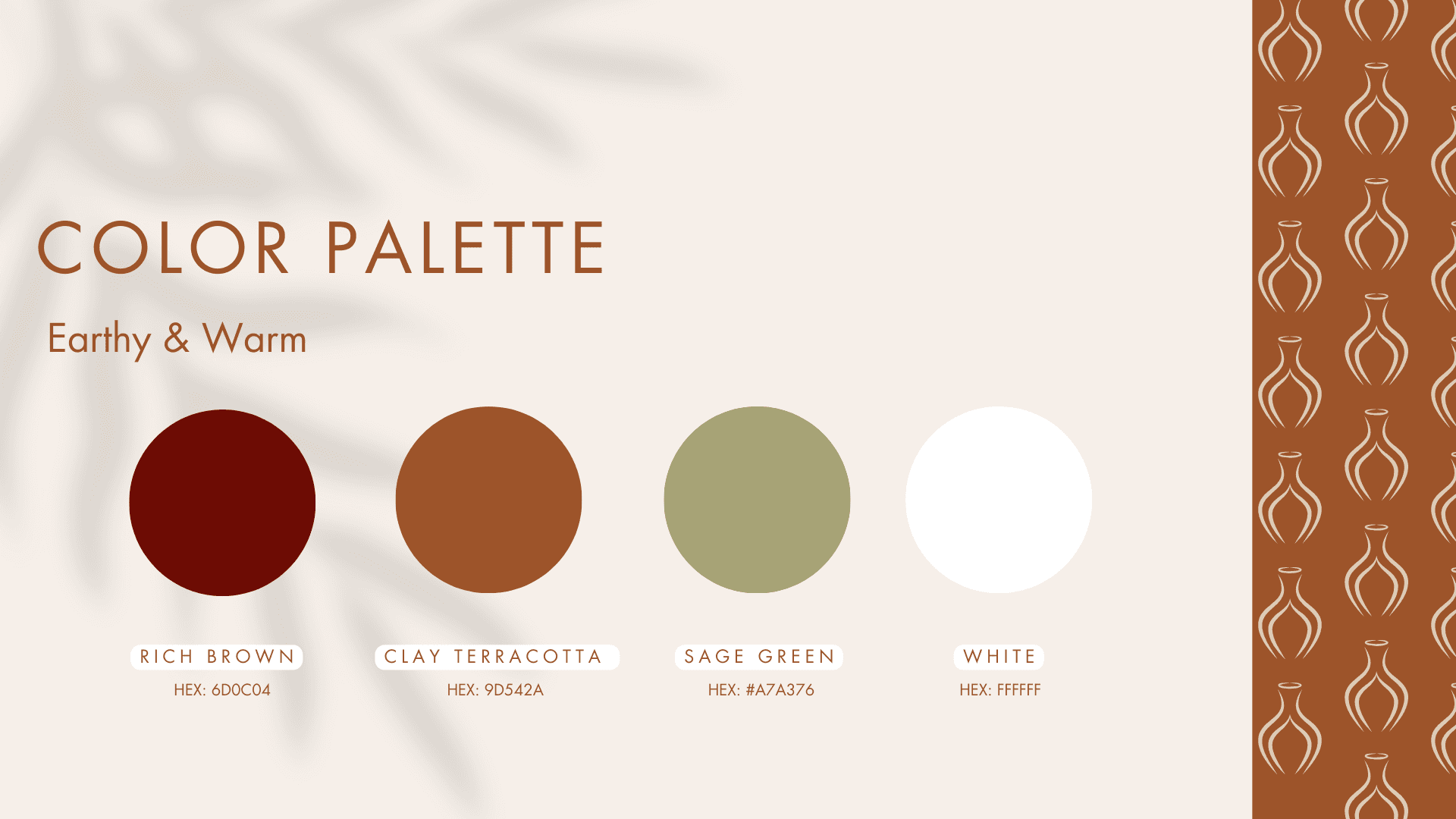
Color Palette: Earthy & Warm
Rich Brown - adds depth and richness
Clay Terracotta - evokes raw ceramics and warmth
Sage Green - grounding and organic
White - welcoming and neutral backgrounp
These colors reflect nature, grounding energy, and creative flow, helping visitors feel at peace and inspired.
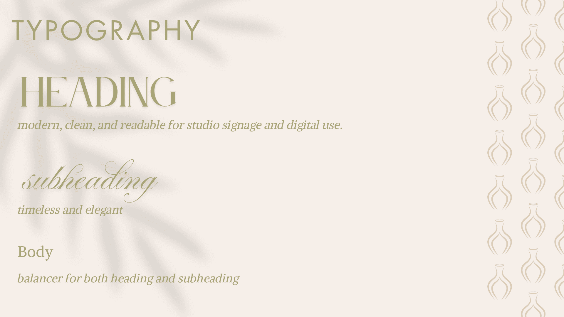
Typography: Slow Beauty in Every Letter
Typography: Slow Beauty in Every Letter
Typography: Slow Beauty in Every Letter
The typefaces chosen for Ahalya Ceramics reflect the brand's core values - warmth, elegance, and a deep connection to craft. Each font plays a distinct role in communicating the studio's atmosphere, from earthy sophistication to hand-touched intimacy.
The typefaces chosen for Ahalya Ceramics reflect the brand's core values - warmth, elegance, and a deep connection to craft. Each font plays a distinct role in communicating the studio's atmosphere, from earthy sophistication to hand-touched intimacy.
The typefaces chosen for Ahalya Ceramics reflect the brand's core values - warmth, elegance, and a deep connection to craft. Each font plays a distinct role in communicating the studio's atmosphere, from earthy sophistication to hand-touched intimacy.
1. Heading - Le Jour Serif A refined, fashion-forward serif with classic proportions and soft detailing.
Why it works: It evokes a sense of timeless craftsmanship and understated luxury, much like ceramics themselves.
Use: Page titles, hero sections, product names, and class names.
Feel: Elevated, clean, slow-paced, intentional.
2. Subheading - Parfumerie Script Pro A graceful, flowing script that mimics the rhythm of handwriting and artisan signatures.
Why it works: It adds a personal, human touch - as if each section is signed with care.
Use: Section intros, quotes, or accents on product cards and invites.
Feel: Romantic, intimate, soulful - like a brushstroke in clay.
3. Body - Alike A legible, warm serif that maintains readability without losing charm.
Why it works: The slight calligraphic feel complements both the headline serif and the organic scri pt.
Use: Class descriptions, blog content, product details, and FAQ sections.
Feel: Approachable, thoughtful, natural.
Together, these fonts form a harmonious trio that reflects both the refined and raw nature of pottery - polished yet handmade, elegant yet grounded.